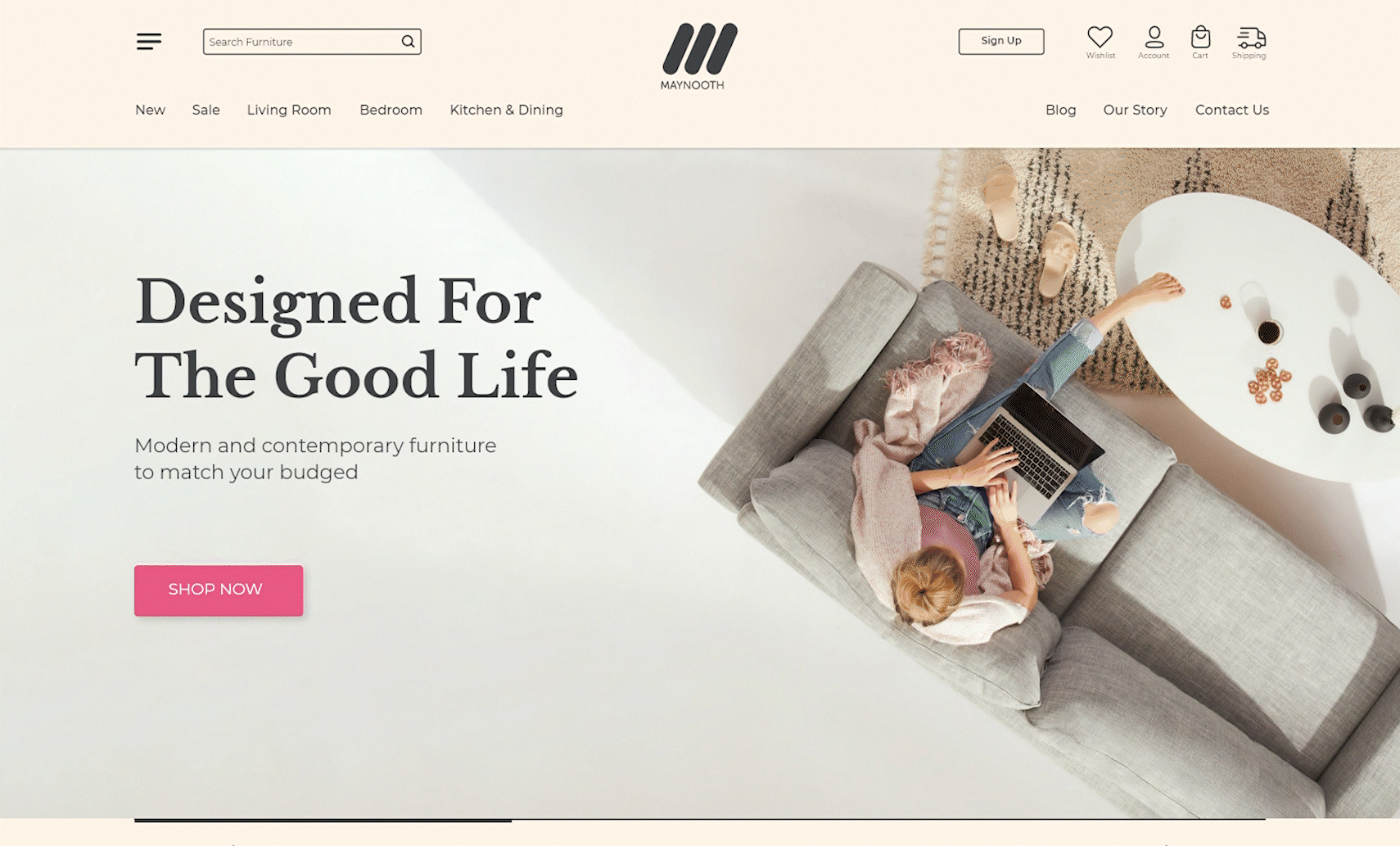
Maynooth
A modern website that lets you choose from a wide range of contemporary furniture, lighting, and artwork.

The challenge
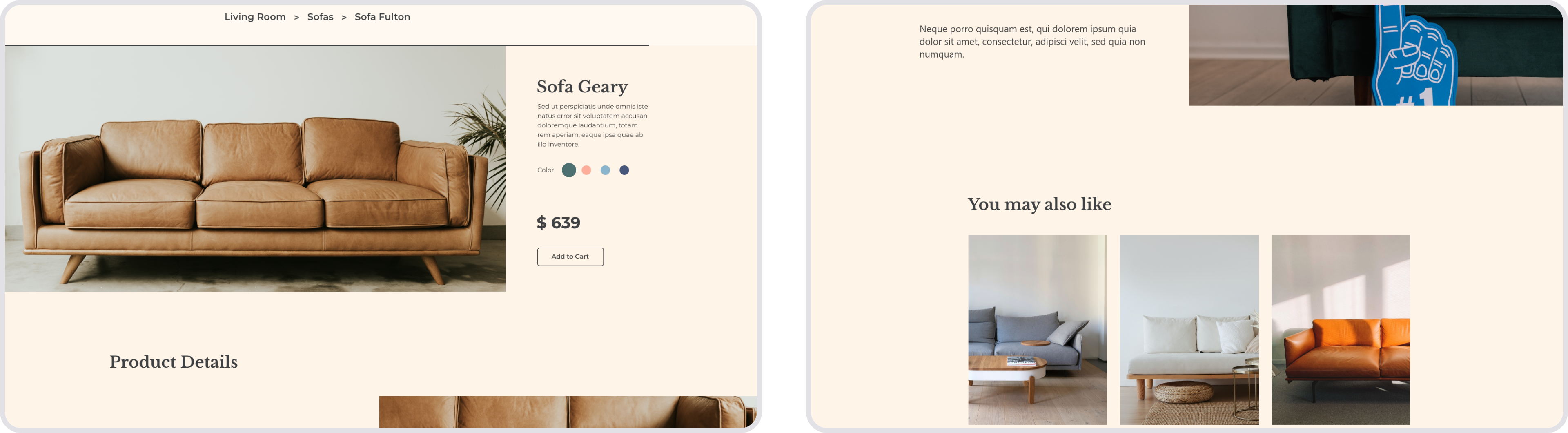
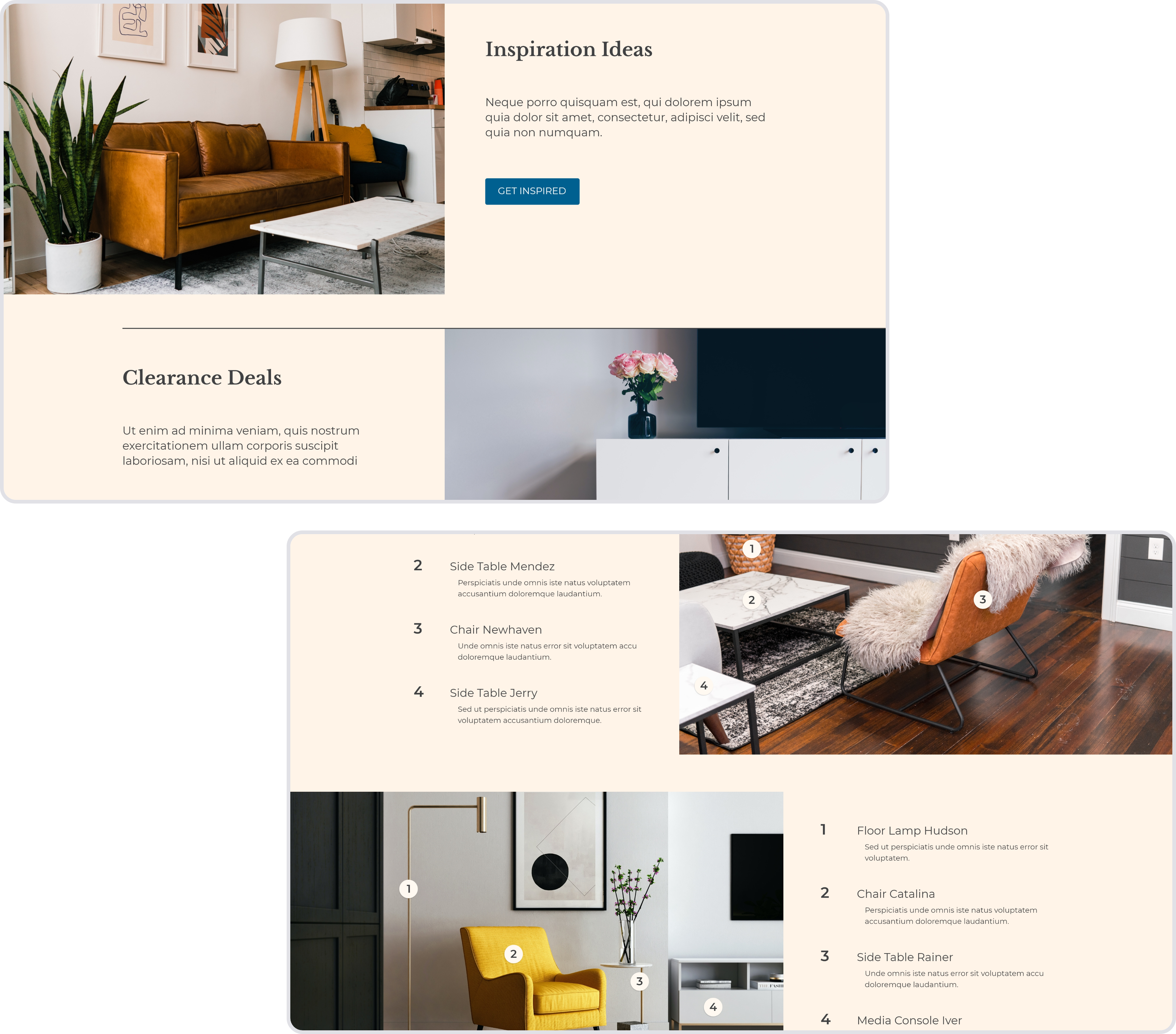
With this project, I wanted to create a website that not only looks but also feels modern and simplistic. The challenge within the design process was to integrate a lot of products within many categories and not lose that airy and light feeling. As this is one of the first projects I ever started as a UX/UI designer this was not an easy task for me. It took many different iterations in almost every stage of the process. An e-commerce site like this needs a lot of different elements to function, which easily results in a crowded look. I mostly achieved the final look of its project through the careful use of whitespace, a muted color pallet, and minimalistic imagery.
The branding process
mood boarding and market analysis
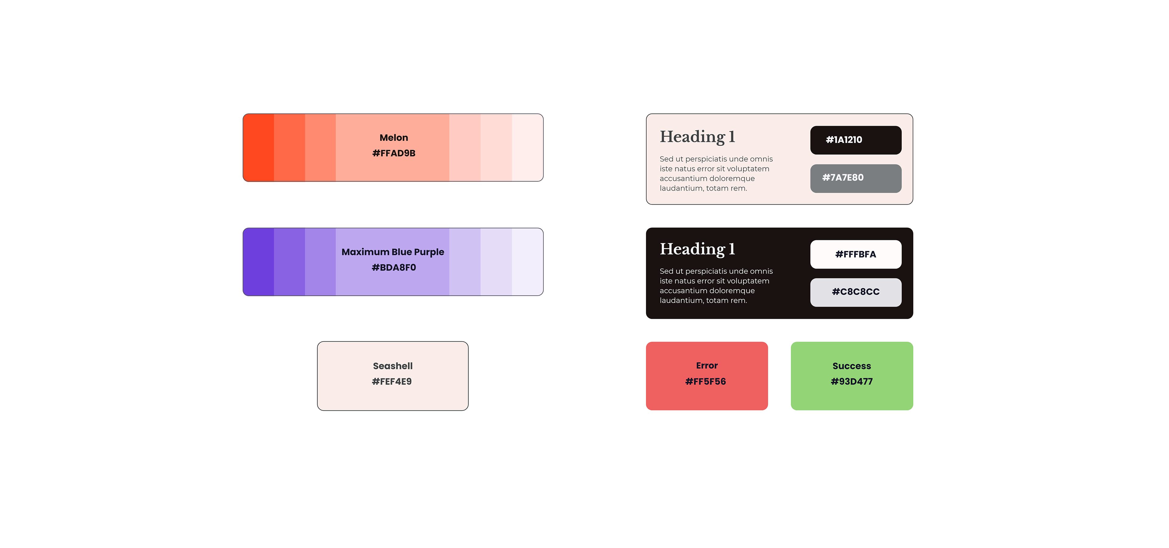
Color scheme

Before settling on this color and typography design I looked at a lot of different websites within the field of furniture marketing. To contrast the simplistic feel, and give the website a more premium appearance, I decided to use a serif typeface. The two main colors with their different shades are mostly used as accent colors, while the two background colors, Seashell and Alabaster, do most of the heavy lifting. Although this is a more unusual approach I decided to take this route to make the accent colors stand out even more.
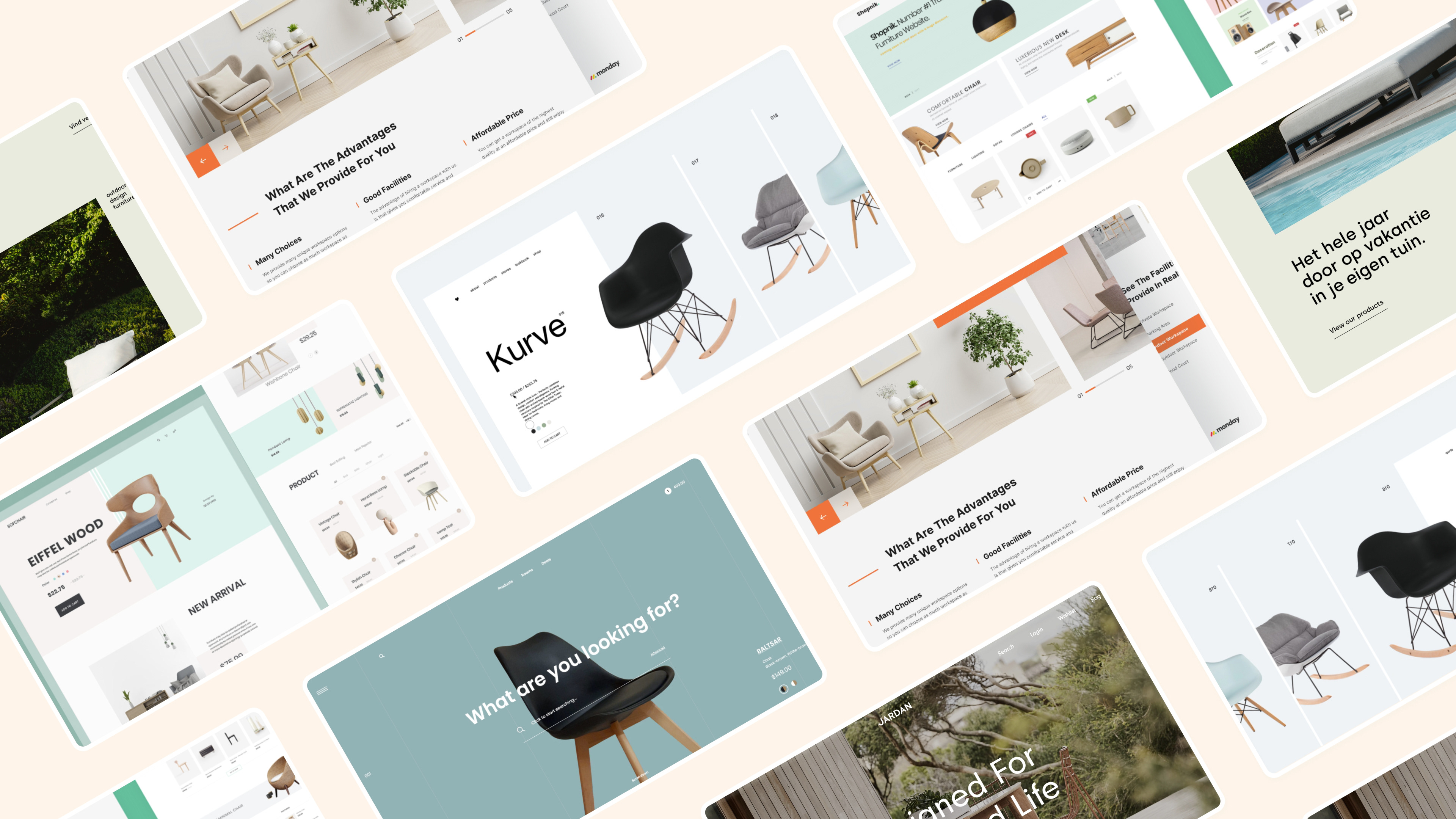
The design I came up with
The end result hopefully achieves all the goals I have set out for this project. I did some user testing in which most of the participants navigated the website without any problems. At this stage, I started to work on some animations. I integrated some of these into my adobe XD prototype. You can get a small glimpse of them down below.

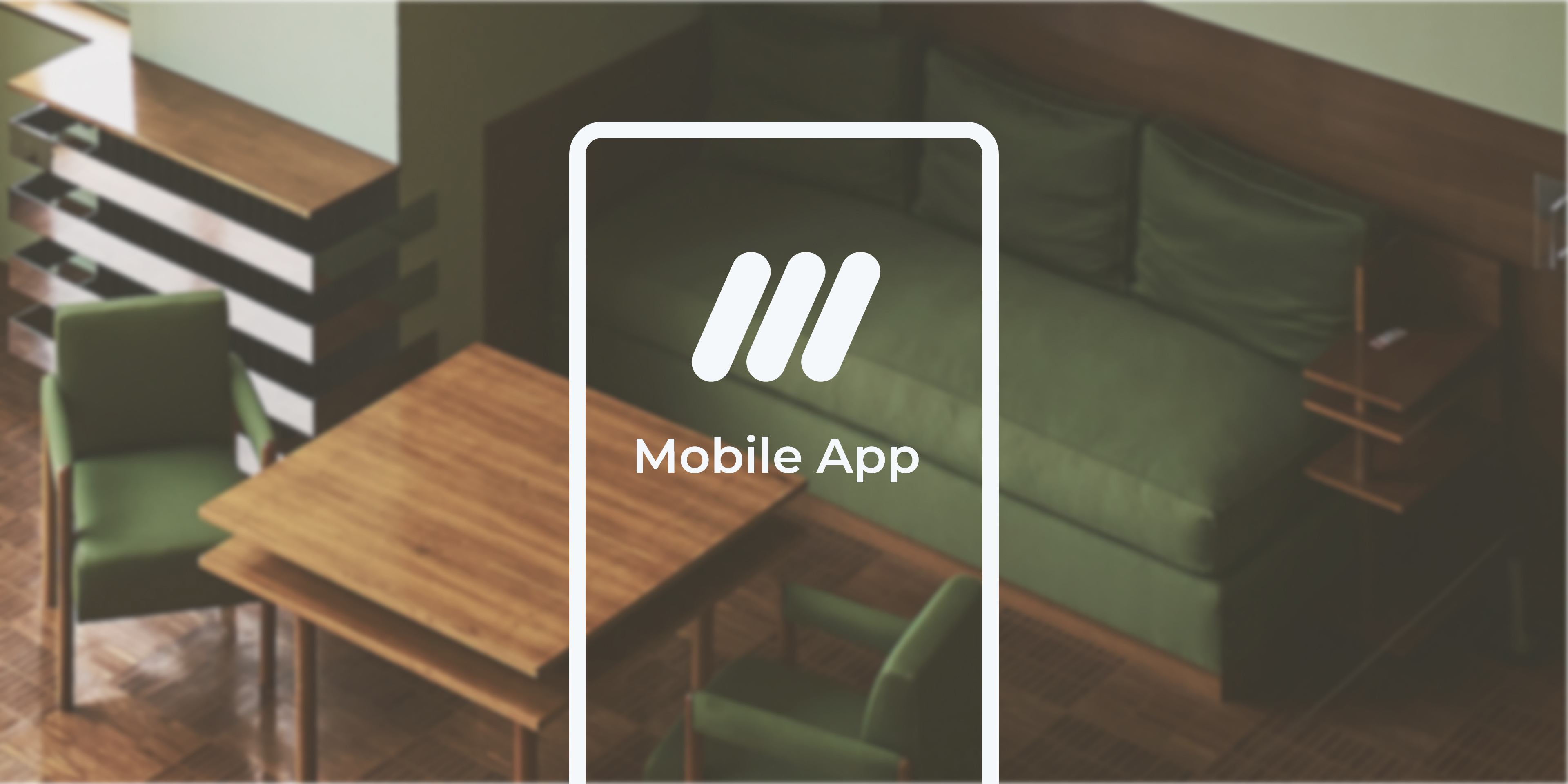
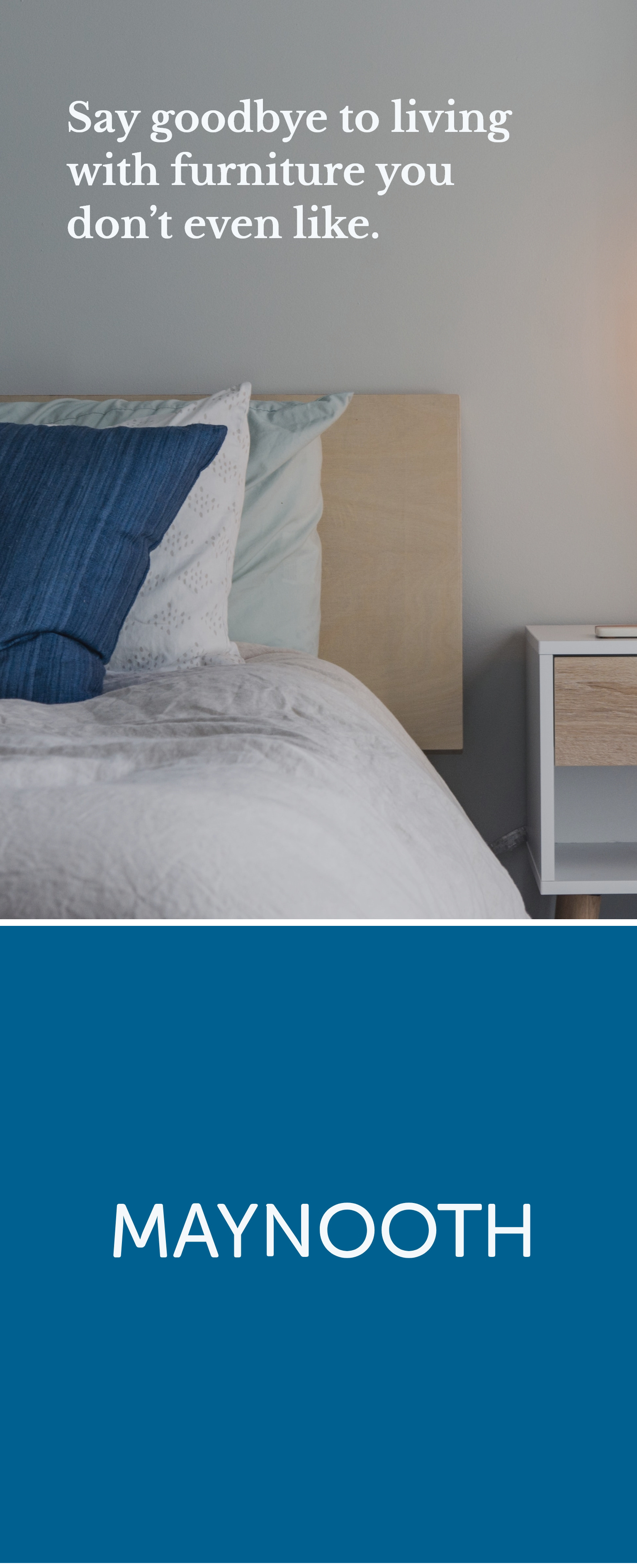
The unique
mobile design
For the mobile version of the Maynooth furniture website, I decided to use a mostly new color system. This would most likely not be the case if this was a real project because there should be a unified look of the website across different platforms. Being a practice and portfolio project of mine, I saw this as a great opportunity to further develop my color-related skills. Apart from the colors, I tried to keep the look and feel similar to the desktop version of the website.